Tata’s Logo Transformation: Did the Brand’s Energy Change?
Everyone sees a logo as a visual symbol.
But what if a logo is more than just a design?
What if, when India’s Renowned Tata Group changed its logo, the energy associated with the brand also changed?
After the new Tata logo was introduced in the late 1990s, Tata’s business identity began expanding beyond its traditional strength in trucks and commercial vehicles towards passenger cars, personal mobility, and consumer-focused products.
Was this simply a business transformation, or was there also a deeper energetic shift associated with the new Tata logo?
In this blog, the Tata Group’s transformation offers an interesting case to explore through the fascinating perspective of Logo Shastra.
Tata Before the New Logo

Before the late 1990s, when people thought of the Tata Group, they did not primarily think of premium cars, stylish SUVs, electric vehicles, or urban family cars.
They thought of trucks, buses, commercial vehicles, rugged utility vehicles, and taxi-friendly cars.
And, of course, brands such as Tata Salt and Tata Steel.
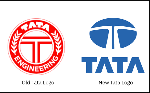
The older Tata logo carried a strong sense of strength, industry, steel, durability, machinery, utility, and mass service.
It was not a delicate or fashion-oriented identity.
It represented a Bharat-building brand – a business group strongly associated with infrastructure, industry, engineering, and public utility.
From the perspective of Logo Shastra, the older Tata logo can be interpreted as carrying stronger Saturn and Mars energies, representing discipline, machinery, engineering, durability, labour, weight, and industrial strength.
In astrological terms, Saturn is traditionally associated with steel, labour, discipline, and heavy industries, while Mars represents machinery, engineering, action, and physical force.
Together, these energies symbolically reflect the strong industrial character that Tata had built over the years.
The Major Transition in the Late 1990s
Then came an important phase in Tata’s journey.
In the late 1990s, the group introduced a new logo, featuring a smoother blue oval and a stylised “T”. Around the same period, Tata introduced the Indica, India’s first indigenously developed passenger car.
This was more than the launch of a new vehicle.
It represented that the inherent energies of the new logo brought a significant change in Tata’s business direction.
Tata was no longer communicating only:
“We build trucks and vehicles for India.”
It was also communicating:
“We build cars for the Indian family.”
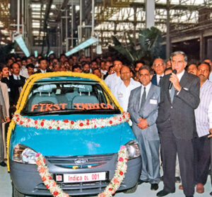
The Indica marked Tata’s stronger entry into the personal and family automobile space.
From a Logo Shastra perspective, this represented an interesting energetic transition, from a predominantly industrial and utility-oriented identity towards a more consumer-facing, modern, aspirational, and universal identity.
Also Read: Why your Business Logo Matters more than you Think?
Did Tata’s Commercial Vehicle Dominance Decline?
This is where the story becomes particularly interesting.
Tata did not abandon its industrial roots. Instead, it expanded beyond them.
Over time, Tata strengthened its presence in passenger cars and SUVs and eventually became an important player in electric mobility as well.
From a Logo Shastra perspective, the timing of the visual transformation and Tata’s expanding consumer identity makes the case fascinating to examine.
From Utility to Aspiration
There is another important shift worth considering.
Older Tata vehicles were often associated with ruggedness, durability, commercial use, and taxi fleets.
While the taxi image may not sound glamorous, it represented something extremely valuable: reliability and utility.
The energies of the older Tata logo therefore carried strong associations with durability, dependability, and practical value.
As Tata moved deeper into the passenger vehicle market, the brand increasingly had to compete in a different psychological space.
Customers were no longer comparing Tata only with commercial or utility vehicle manufacturers.
They were also comparing it with Maruti Suzuki, Hyundai, Mahindra, Kia, Toyota, MG, and other passenger-car brands.
What Does Logo Shastra Say?
Logo Shastra was founded by Dr. Achary Kalki Krishnan Ji after more than 40 years of research and an in-depth study of over 30 lakh logos worldwide.
This extensive research led to the development of a unique approach that looks at logos beyond their visual appearance, through their symbolic, psychological, astrological, and energetic dimensions.
A logo is not merely a graphic element.
In Logo Shastra, a logo is viewed as a Yantra of corporate energy.
Just as a Yantra in Hinduism channels particular forms of energy, the combination of elements, colors and shapes in a logo continuously radiate energies that leave their impact on the entire brand.
This is the foundation of Logo Shastra, an approach to Scientific logo designing based on the following sciences-
Astrology | Vastu Shastra | Numerology | Feng Shui | Colour Psychology | Mythology | Graphology | Symbology
The objective is not simply to create something attractive.
The idea is to create a visual identity that is meaningful, harmonious, and aligned with the brand’s purpose and direction.
Why Does Logo Alignment Matter?
A well-aligned logo helps create a stronger and more consistent brand identity.
A harmonious logo always supports:
- Continuous prosperity
- Growth and expansion
- Strong customer relationships
- Employee productivity
- Competitive positioning
- Brand reputation
- Financial stability and profitability
What Can We Learn From Tata?
The Tata case presents an interesting lesson.
The brand evolved from an identity strongly associated with industrial strength, heavy machinery and commercial vehicles towards a much broader identity that also embraced passenger mobility, SUVs, and electric vehicles.
From a Logo Shastra perspective, this was a major shift from industrial dominance towards broader consumer expansion- that the new logo brought.
The important point is not that changing a logo automatically changes a company’s destiny.
Rather, a logo becomes part of the energy, influencing decision-making, business direction and the overall growth trajectory of a business.
Conclusion
The Tata story raises an important question:
When a company changes its logo, does it also change the energy surrounding its brand?
Tata’s transformation from a predominantly industrial and commercial-vehicle identity to a broader consumer and mobility brand makes this question particularly fascinating.
The new Tata logo helped represent a Tata that was not limited to trucks, steel, and heavy industry,but was also entering the lives of everyday consumers through cars, SUVs, and new forms of mobility.
This is what makes Logo Shastra more than just logo design.
The next time you look at a corporate logo, ask yourself:
What is this logo communicating?
What energies does it represent?
And what direction is it taking the brand?
That is where the deeper study of Logo Shastra begins.